N26

fintech, digital banking
Years worked

2019-2021

Type of work

Full-time

Type of work

UX, UI, Research

Where to find project

Apple App Store,
Google Play Store

Long story short

What did I do?

  • Led efforts to improve a core feature for a mobile banking app.
  • Introduced new creation flows to improve discoverability and understanding how users can maximize the way how they can save their money.
  • Contributions to design system and leading product discovery workshops and user research.

Who is N26?

  • N26 is a European digital mobile bank based in Berlin, Germany.
  • They disrupted the traditional way of how Europeans banked and was widely known for making banking easy and convenient.
  • At the time there were around 1500+ employees with around 40+ designers.

Problem

What is Spaces?

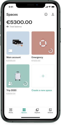
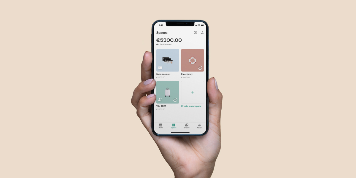
  • Spaces is a feature that enables N26 users to organize their money into multiple sub-accounts for different purposes. (ex. saving up for a vacation, emergency fund, household expenses)
  • Users can set savings goals, automate deposits, and even share Spaces with others, and more.

User Problems Identified

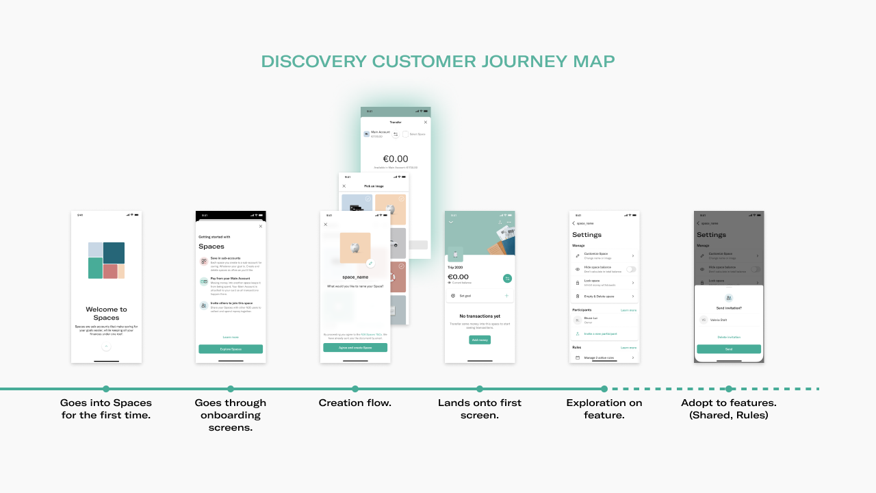
  • Users do not fully comprehend all the utilities Spaces had to offer, especially in the beginning despite there existing an onboarding flow.
  • Advanced features were buried 3-4 steps deep in the user flow after creating a space; creating high interaction costs and low discoverability.

After onboarding to Spaces for the first time, it takes at least 6 actions for a user to adopt a feature. As a result, only 3.5% of users discovered the capabilities of what Spaces has to offer.

Constraints

Top Product Goals

  • Increase engagement within the product when using Spaces.
  • Improve adoption of low usage but highly requested features.
  • Create a short and long term strategy on where existing and new features would live within Spaces

Key Metrics

  • Feature adoption rate
  • Task completion rate
  • Impressions through funnel

Examples of the "How Might We" we pursued:

HMW...

...surface features early in the user journey?

HMW...

...help users understand how else they can use Spaces?

HMW...

...increase awareness of other feature offerings from Spaces?
Process

Team

  • 2 Product Designers
  • 1 Product Manager
  • 1 User Researcher
  • 5+ Engineers

Methods

  • User Interviews/Tests
  • Card sorting
  • Design Sprint/Workshops

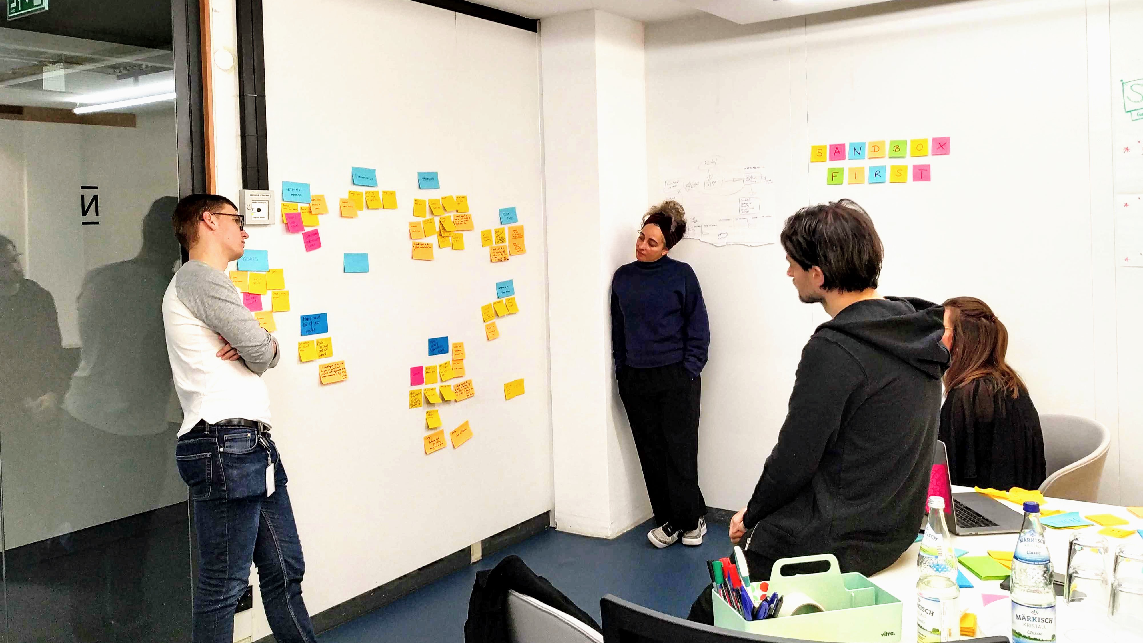
In a fast-paced environment, the challenge is always priortization in the product roadmap, so design can play a role in challenging the status quo with the insights gathered. I led workshops with designers and stakeholders to define concepts and initiatives and to align on the strategic impact we sought.
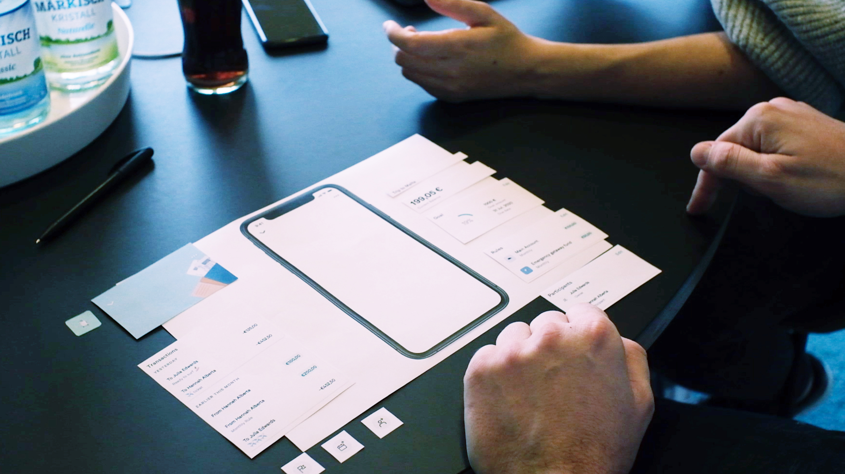
Along with previous research and data, I also conducted my own research using methods like user interviews, card sorting, usability tests to validate concepts, understand the overall user journey, and generate further insights. Here is an example of using card-sorting to better understand the importance behind each component and feature.
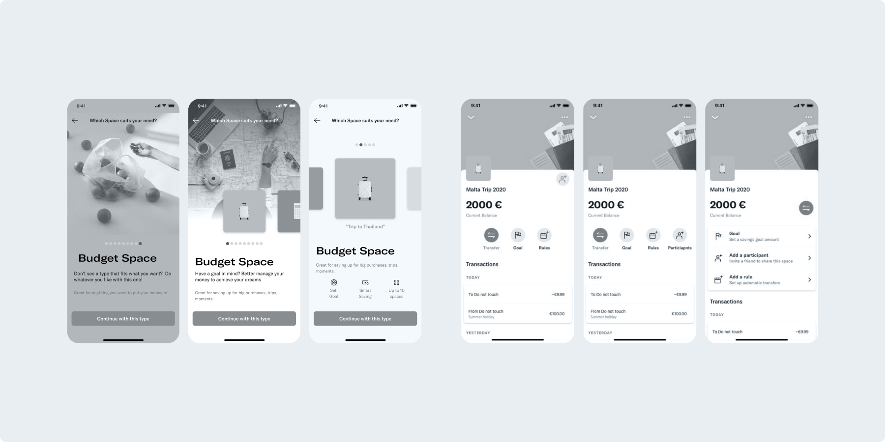
These were some discarded explorations of the creation flows and the details page that I worked on. Feedback was gathered from stakeholders and team members to iterate the designs further while keeping everyone involved and aligned. [new: old throwaway designs of both parts]
Results

My impact

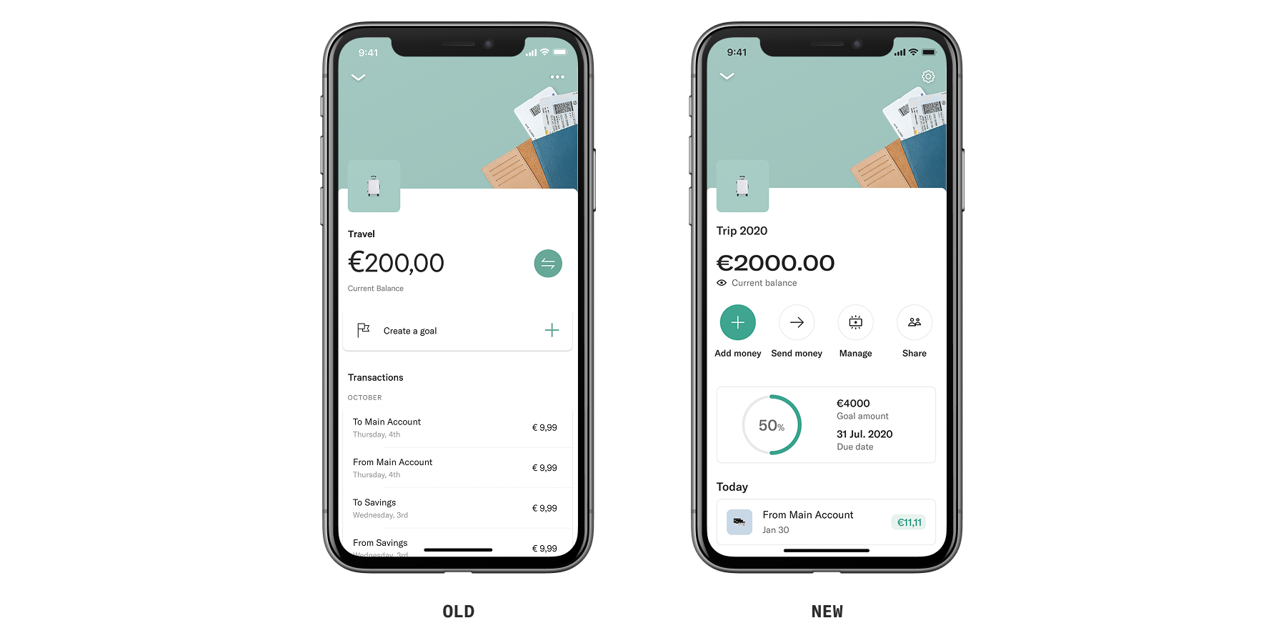
  • Redesigned the details page which led to a 252% increase in adoption of less used features.
  • Introducing a new creation flow reduced the number of steps to discover features by 3, which resulted in positive feedback from users in a better understanding of additional ways to use Spaces.
  • Crafted a short and long term strategies envisioning how Spaces will evolve to support more use cases and plan where new features will live.

My learnings

  • Rather than explaining, showcasing different ways a feature can be used gives a higher chance of discoverability and comprehension.
  • Don't overcomplicate designs, and always be prepared to throw away ideas. Pairing with another designer and involving stakeholders helped iterate and improve the designs.
  • Highly requested features doesn’t necessarily result in high adoption. It's always good to form hypothesis and assumptions.

An improved design of a Spaces page with clearer affordances and a structured information hierachy that surfaces features as soon as users open or creates a new Space. [old/new side by side]
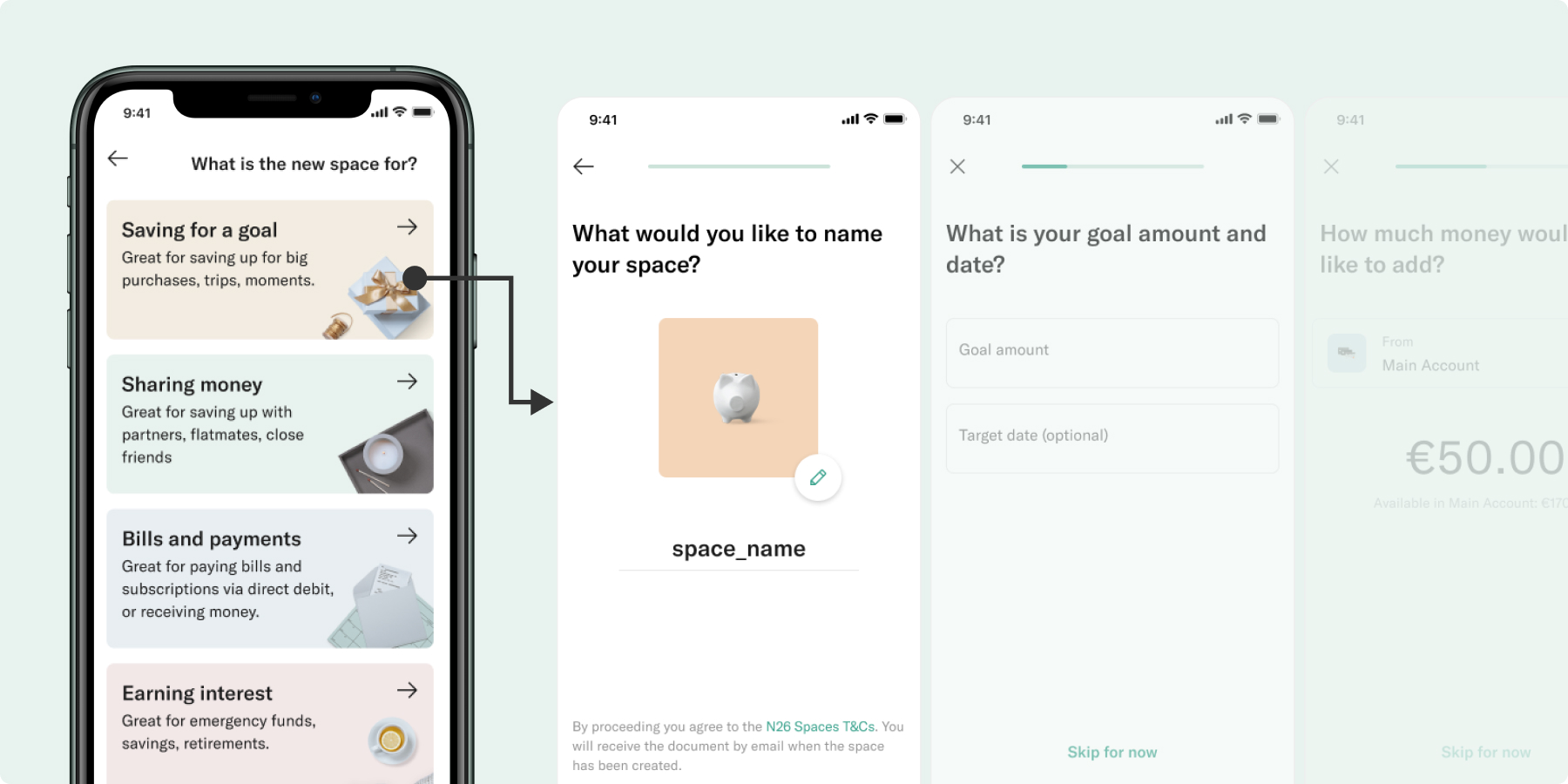
A new creation flow that showcases different use cases that guides users through tailored steps to optimize their Space for their needs. [main creation page with difference use cases (stealfrom slide)
check out the app on your favourite OS


Download on the App Store Get it on Google Play

more of his featured works

trivago

travel, hotel search

helping travelers find their ideal hotel

you made it to the end!
perhaps we can keep in touch?


Coded amateurly with coffee at hand.
© Bruce Lui