trivago

travel, hotel search
Years worked

2017-2019

Type of work

Full-time

Type of work

UX, UI, Research

Where to find project

Apple App Store,
Google Play Store

Long story short

What did I do?

  • Had 1 month to redesigned and build the entire mobile app from scratch!
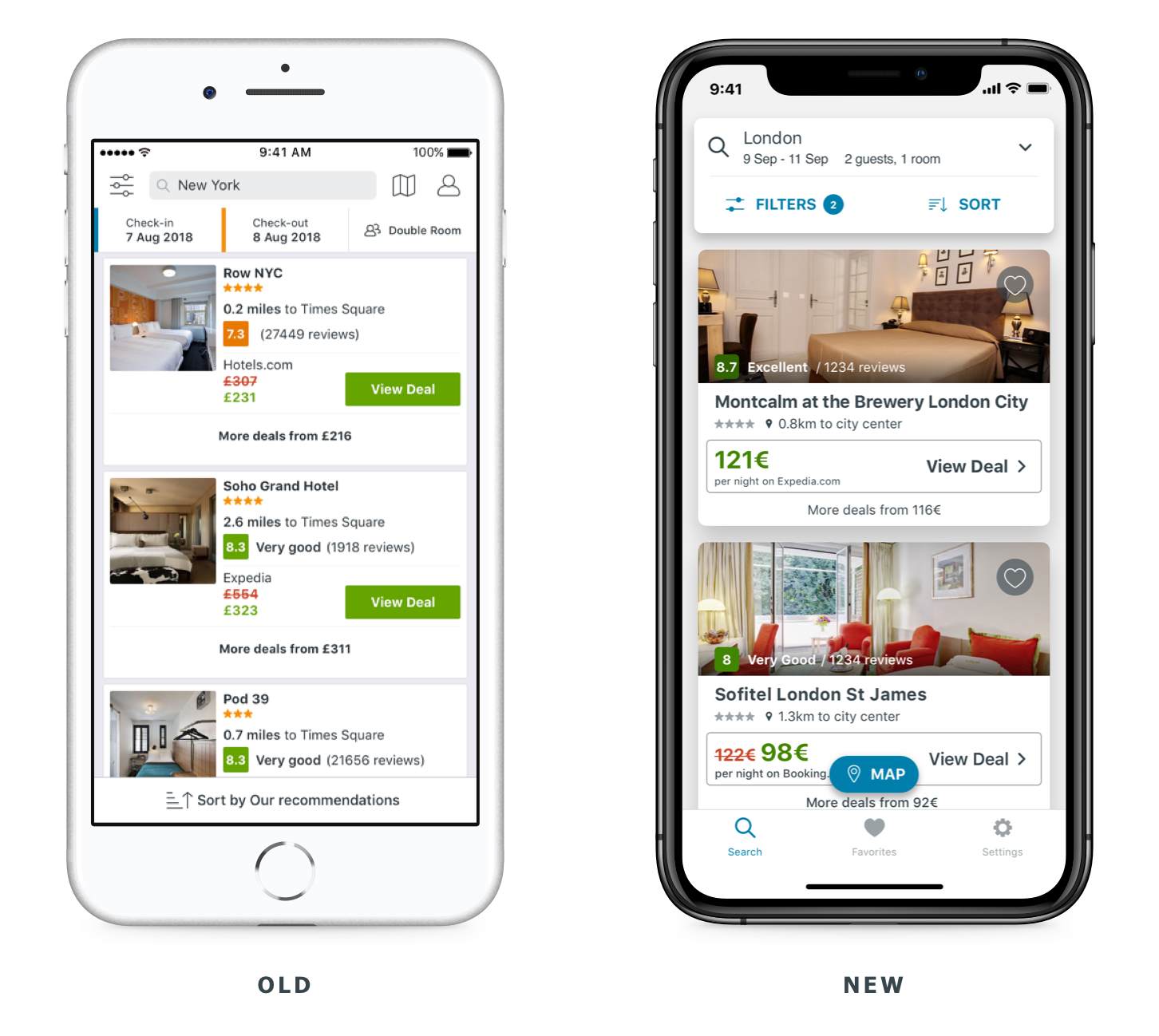
  • Iterated and optimized heavily on the results page.
  • Ran design sprints and advocated for motion UX/UI to the company.

Who is trivago?

  • trivago is a travel tech company based in Düsseldorf, Germany.
  • They are known for their search engine for hotels and other types of accommodations.
  • At the time there were around 1200+ employees with around 25+ designers.

Problem

What does the app do?

  • Helps users explore and compare hotel options from multiple OTA websites (ex. Booking.com, Expedia, etc)
  • Enables users to find the best deals that suit their needs.
  • Shows imagery, amenities, reviews and more to help users understand each option.

User Problems Identified

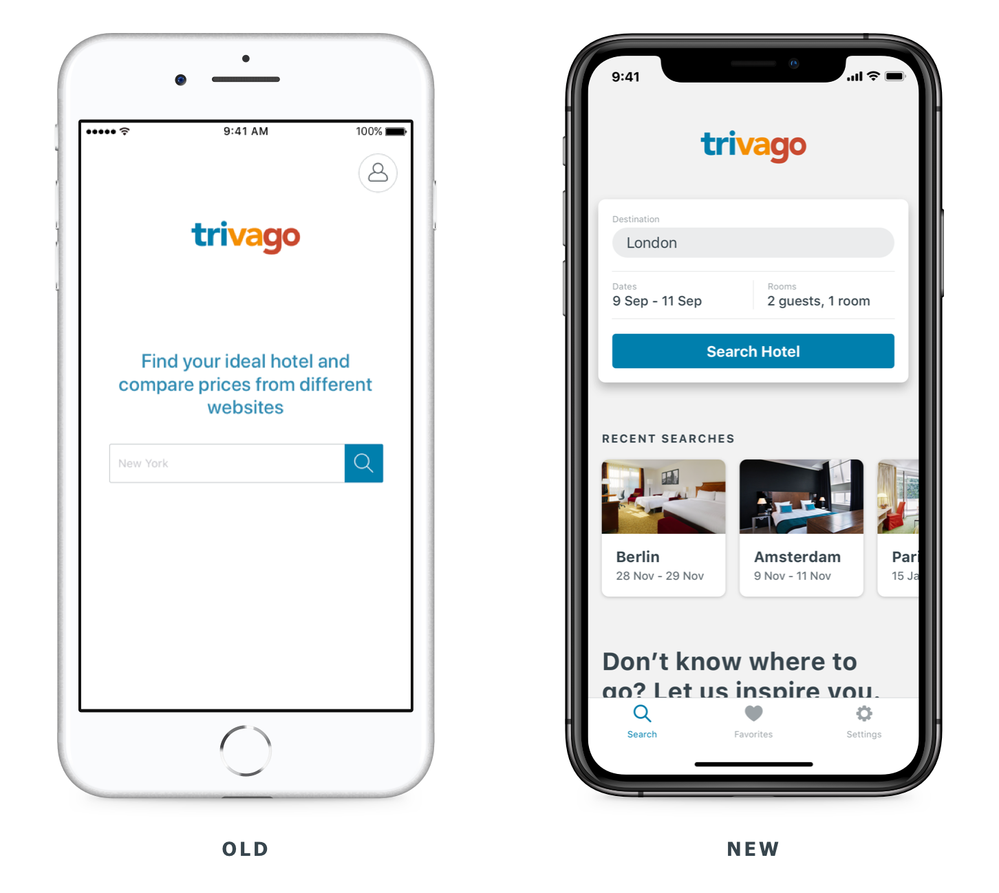
  • Power users like to explore their options before going straight to booking; and did not feel satisfied to do so with the old designs.
  • Some information displayed was confusing. (ex. hotel stars mistaken as rating stars)
  • Features like favouriting hotels for later and comparing between the options were missing.

The code base was too old to continue with development, so we took this as an opportunity to also reimagine what the mobile experience would be like. The only problem is that we were given a tight timeline of one month to pull everything off.

Constraints

Top Product Goals

  • Empower users to discover and explore more hotel options.
  • Create a simple, innovative, and emotionally-engaging mobile experience.
  • Iterate and optimize for click-out to OTA performances.

Key Metrics

  • Click-through rate
  • Search rate
  • Impressions and bounce rate

Examples of the "How Might We" we pursued:

HMW...

...give users more confidence to explore their hotel options?

HMW...

...enable users to compare their hotel options more easily?

HMW...

...give more clarity on hotel pricing and information?
Process

Team

  • 4 Product Designers
  • 3 Product Managers
  • 1 User Researcher
  • 20+ Engineers

Methods

  • Qualitative: User tests, reviews, feedbacks, NPS
  • Quantitative: A/B tests,
  • Explorations and Alignment: Design sprints, workshops, competitor analysis

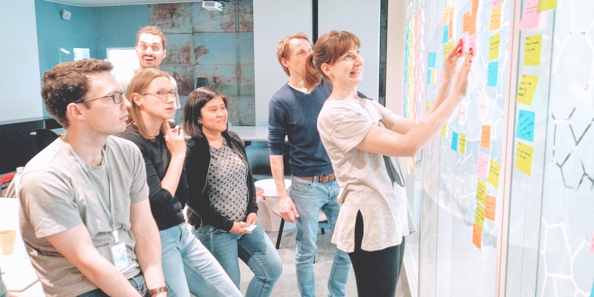
I facilitated multiple design sprints whenever there was a big topic in the pipeline. By collaborating with product, design and engineers we created alignment and worked closely together to thoroughly explore the problems. The engineers in the team were especially appreciated for being involved in the process; a design direction was then picked up by me or another designer to iterate and later test.
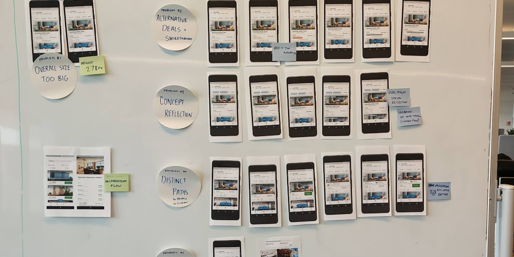
Back when posting designs on a whiteboard in the office were a thing, I would post a lot of different iterations of the results page to gather feedback from not just the team but any passersbys in the office. It helps to not only be transparent with my process and possibilities, but it also helped me coordinate on making a plan to A/B test the different variants.
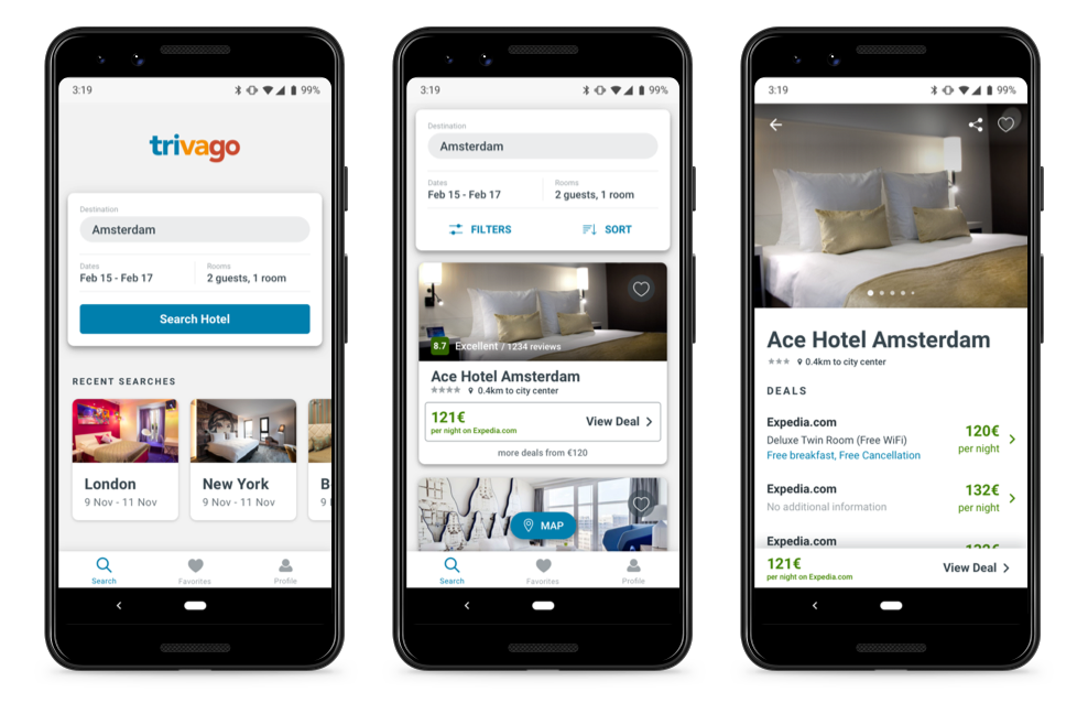
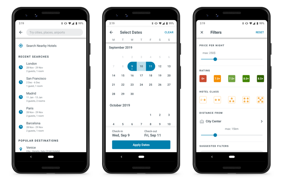
Results

My impacts

  • The redesigned app received a Google Playstore Editor’s Choice and won Best Travel App of the Year from popular Brazilian tech blog Canaltech.
  • Significant increase in impressions on detail pages which showed users are exploring more hotel options and finding more relevant information to aid their decision process.
  • The series of optimizations resulted in an increase in CTR and better performance than the mobile website counterpart.

My learnings

  • Being able to let go of your creations; some of my personal favourite designs did not make a significant improvement to the metrics when we A/B tested them.
  • Set clearer benchmarks and expectations when launching redesigns. As we had such a tight deadline to pull everything off, there was little consideration on the definition of success.
  • Qualitative data is just as important as quantitative. Data can tell us a lot of things, but doesn’t explain why and how things turned out that way. This often ends in a lot of guessing games and assumptions.

I advocated and pushed to explore more motion in our UX/UI. A topic I am very excited and passionate about.

Another topic that gets me excited. What I wanted to explore more for the redesign was to not just provide helpful microinteractions that help users understand their actions but also these moments of delight that enrich the experience. By being more playful with simple actions, we can not only connect with users more but also emotionally engage with them as well.

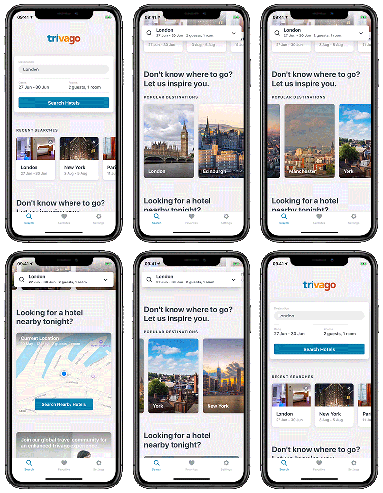
Our goal for the redesign wasn't only just improve usability for our users but also create meaningful touchpoints to understand our product and what they can do. Take the "dealform" for example, depending on where and how you scroll, it reacts to show how it works and assists if you need to change your dates or destination.

Check out this video on our team talking about the whole journey here!
(I was unfortunately on vacation when they taped it, so couldn't make the cut...)

check out the app on your favourite OS


Download on the App Store Get it on Google Play

more of his featured works

N26

fintech, digital banking

engaging ways on how to save money